Click below to listen to my 2 min. Garden Bite radio show: Using the color wheel in garden design
Winter’s always a good time to make plans for your garden. Yesterday I shared pre-planned garden designs, today I’ll talk about using the color wheel to help you choose colors that compliment!
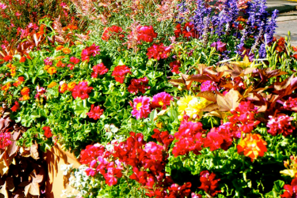
Having a mishmash of color is certainly fine if it doesn’t give you visual overload, however, mixing too many colors doesn’t allow our eyes to gaze more thoroughly, but instead, can deliver a dizzying sight that isn’t necessarily calming.
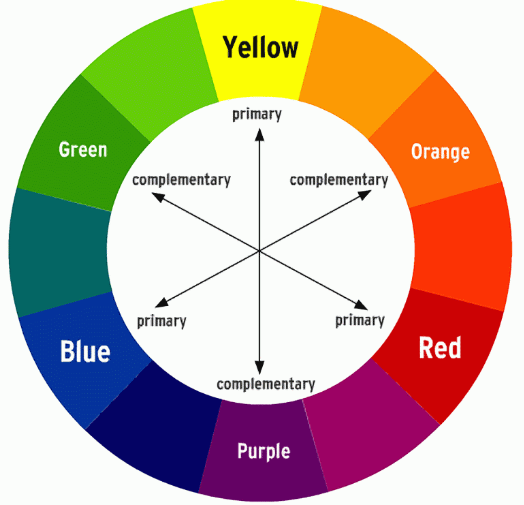
Using a color wheel will guide you. There are 3 primary colors, red, blue and yellow. These are colors that can’t be made by mixing any other color.
Then come the secondary colors, orange, green and purple or violet if you prefer.
Then come the tertiary colors, such as blue/green, orange/yellow.
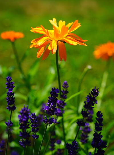
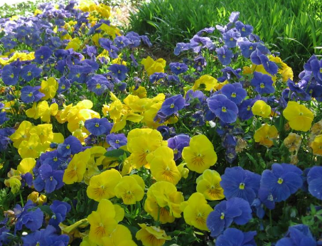
Opposite colors on the wheel are called complementary colors like blue and orange, red and green, yellow and violet. These colors make the other look brighter, they complement each other.
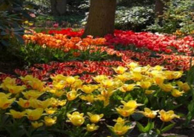
For a soft look, analgous colors deliver. They are colors that are right next to each other on the color wheel. For example yellow, yellow/ orange and yellow/green.
Cornell University suggests you use the middle color as the predominant color and the shades on either side to a lesser extent. Also keep the intensity of the colors the same.
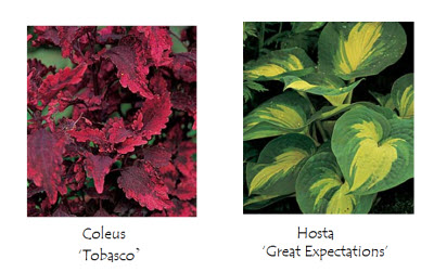
Monochromatic gardens use just one color. A moonlight garden is monochromatic as it uses shades of white. In these gardens, texture is key for diversity. In both foliage and flowers.

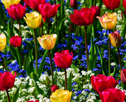
The triad theme uses 3 colors that are opposite on the wheel. Like blue, red and yellow or use their secondary colors green, orange and violet. These gardens can pop.
There are also warm colors, reds, oranges and yellows and cool colors blues, violets and greens. Light pink is a cool color as well.